Sign Board Colour Psychology: Brand Colour Guide
After 35+ years in signage and thousands of shopfront projects, one lesson is clear: the right colour should make your brand feel correct and make the board readable from the road. This sign board colour psychology guide explains how to choose colours that attract customers without sacrificing contrast, warranty life or night visibility.
Last updated:
What Colour Should You Choose for a Sign Board?
Choose a sign board colour by matching three things: your brand personality, your business category and real viewing conditions. Red and yellow can create appetite and urgency, blue and white can support trust, green can feel fresh or medical, and black with gold can feel premium. But every colour must pass contrast, lighting and material checks before production.
Colour psychology helps customers understand your brand faster, but it is not magic. A beautiful colour that disappears in sunlight, clashes with a wall, or glows unevenly at night will hurt the sign. That is why BRS SIIGNS tests colour along with material, letter depth, LED type, panel finish and installation angle.

35+ years signage expertise. Fact-checked: . About BRS SIIGNS
Estimated reading time: 11 minutes
How Colour Psychology Works on Real Sign Boards
Colour meaning works only when customers can read it
Colour can suggest appetite, calmness, luxury, speed, freshness or safety, but the first job of any sign is visibility. National Institute of Design exists as a national-level design institution in India, and practical signage design follows the same logic: visual meaning must support user understanding. A board that expresses personality but cannot be read from 30–60 feet is not effective branding.
For Indian roads, the background is rarely neutral. A shop may sit beside bright flex banners, parked vehicles, wires, trees, painted shutters, glass reflections and moving headlights. So sign board colour psychology must combine brand emotion with field visibility. BRS SIIGNS normally reviews the building photo, wall colour, street direction and day/night requirement before recommending a colour family.
Think in 4 layers
- Brand layer: What should customers feel — trust, appetite, premium value, safety or speed?
- Category layer: Does your colour match customer expectation for a hospital, hotel, cafe, showroom or office?
- Contrast layer: Does the text stand apart from the background in sunlight and at night?
- Material layer: Can acrylic, ACP, vinyl, SS or LED reproduce that colour cleanly for years?
Send your logo and shop photo to check the right colour direction.
Check My Brand ColourCommon Sign Board Colours and What They Communicate
Colour meanings are influenced by culture, business category and personal experience, so they should be used as guidance, not rigid rules. A luxury vegetarian restaurant and a budget fast-food shop may both use red, but the shade, material and lighting must be different. A clinic and a finance office may both use blue, but the clinic needs softer, cleaner readability while the finance office may use a deeper corporate tone.
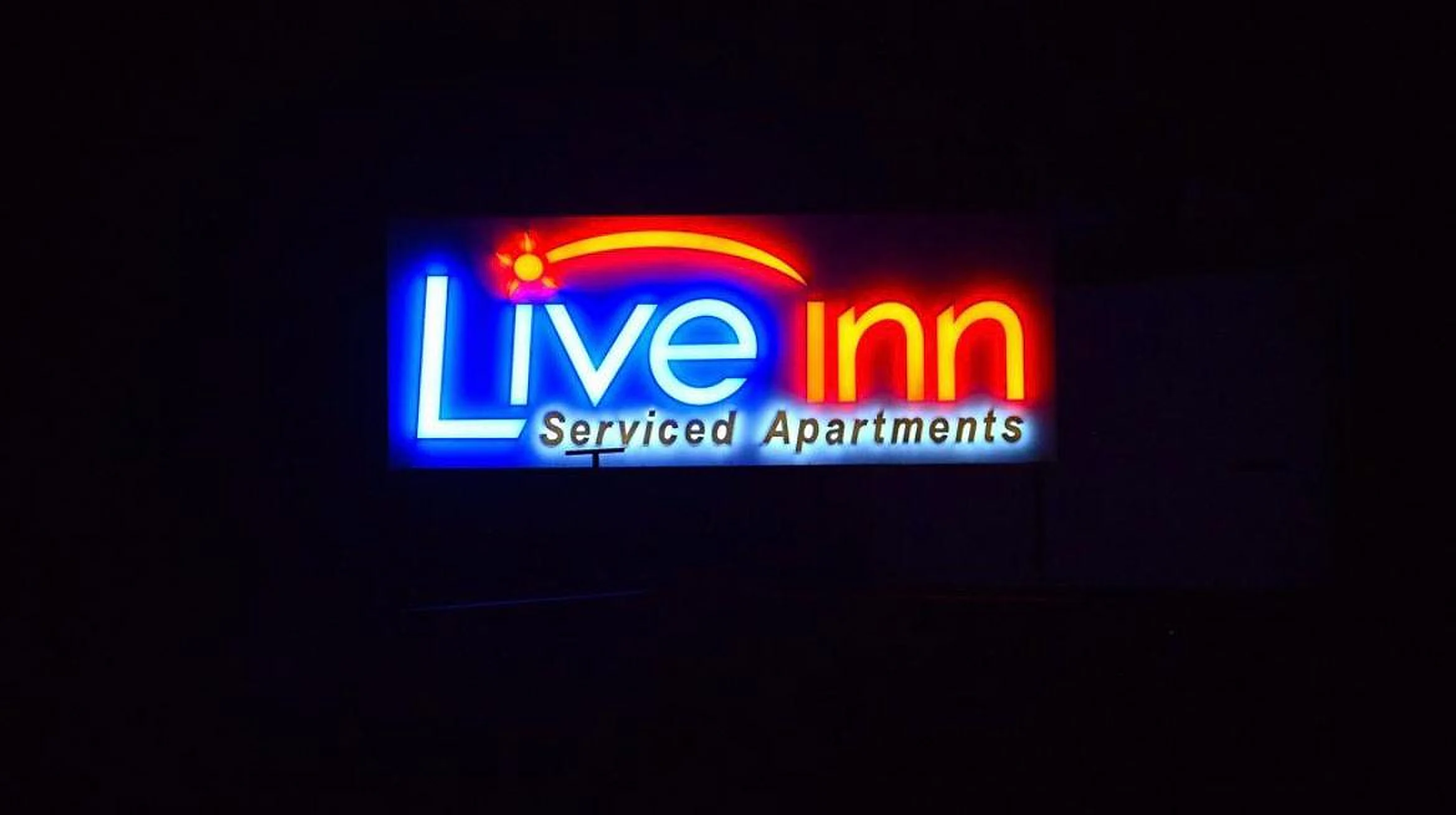
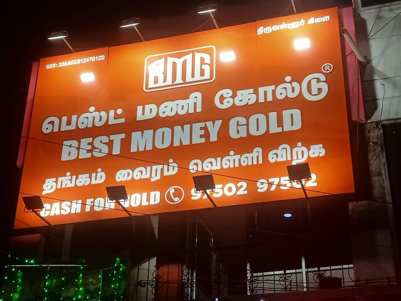
High attention, appetite, urgency and energy. Best controlled with white/yellow accents.
Trust, calm, professionalism and clarity. Useful for clinics, finance and offices.
Health, nature, freshness and safety. Good for pharmacies, wellness and organic stores.
Premium value and celebration. Best with dark panels or 3D metal letters.
Luxury, contrast and seriousness. Strong base for gold, white and copper lettering.
Clean, modern and spacious. Needs dark text or edge lighting for visibility.
Warmth, youth and movement. Works for food, retail and offer-driven frontage.
Creative, premium and boutique. Best when used as an accent, not tiny text.
| Colour Family | Psychological Signal | Best Business Use | Practical Signage Note |
|---|---|---|---|
| Red | Attention, appetite, urgency | Restaurants, offers, emergency visibility | Use with white or yellow carefully; avoid red text on black. |
| Blue | Trust, calm, professionalism | Clinics, banks, offices, education | Works well with white acrylic, halo lighting and clean fonts. |
| Green | Health, nature, freshness | Pharmacy, organic stores, wellness, hospitals | Avoid dull green on grey; keep contrast high. |
| Black + Gold | Luxury, premium, tradition | Jewellery, hotels, premium showrooms | Use 3D gold letters on dark panels for better depth. |
| Orange / Yellow | Energy, warmth, fast recall | Food, retail, offers, children-focused brands | Very bright colours need controlled lighting to avoid glare. |
| White / Ivory | Clean, simple, modern | Corporate offices, boutiques, clinics | Needs dark lettering or edge lighting for distance visibility. |
Want to convert your logo colours into a readable sign?
Send My LogoColour Psychology Fails When Contrast Is Weak
Use emotional colour, but test contrast like a professional sign maker
The WCAG contrast guidance explains that text needs enough contrast with its background to be read by people with low vision or impaired contrast perception. Website contrast rules are not the same as outdoor sign board rules, but the principle is extremely useful: letters must separate clearly from the background. A sign is viewed in sun, shade, rain, vehicle lights and night glow, so weak contrast fails faster than most owners expect.
For sign board colour psychology, the best test is simple: reduce the design to black and white. If the main brand name still stands out, the colour values are probably usable. If everything becomes a similar grey, the sign may look attractive on screen but dull outdoors. BRS SIIGNS checks colour, stroke width, letter thickness, back panel shade and LED diffusion before manufacture.
Safety colours should not be copied blindly for brand signs
IS 9457 safety colours and safety signs gives structured use of safety colours for warnings, mandatory actions and emergency information. A business sign is different from a safety sign, but the lesson is useful: colour has meaning only when it is used consistently and visibly. Red everywhere creates noise; green everywhere may not fit a jewellery store; gold without contrast may disappear in daylight.
For outdoor signs, also consider weather and public lighting. The India Meteorological Department context reminds us that Indian regions face different sunlight, monsoon and humidity patterns. Coastal, hot, dusty and high-traffic areas need different colour durability and cleaning plans.
Need help checking contrast before production?
Check ContrastBest Colour Direction by Business Type
A board should make a customer say, “This looks like the kind of business I need.” That is where colour psychology is powerful. A hospital board should feel calm and trustworthy; a food outlet should feel warm and inviting; a jewellery board should feel premium and stable; a coaching institute should feel clear and confident. The colour is not alone — font, size, material and lighting complete the message.
| Business Type | Recommended Colour Direction | Suitable Sign Type | Why It Works |
|---|---|---|---|
| Restaurant / Cafe | Red, orange, yellow, warm white | LED neon, channel letters, backlit flex | Warm colours support appetite and night footfall. |
| Hospital / Clinic | Blue, white, green | Acrylic letters, LED channel letters, wayfinding signs | Calm colours reduce confusion and improve trust. |
| Jewellery / Premium Retail | Black, gold, ivory, copper | 3D SS titanium gold letters, halo lights | Depth and metal finish matter more than bright colours. |
| Corporate Office | Blue, white, charcoal, silver | Acrylic logo signs, 3D letters, modular signs | Professional colours need clean spacing and subtle lighting. |
| Education / Institute | Blue, red, white, green | 3D letters, ACP panel signs, LED boards | Readable bilingual layout is more important than decoration. |
| Pharmacy / Wellness | Green, blue, white | LED sign boards, acrylic signs | Colour should signal health without low-contrast pale tones. |
For businesses operating across states, keep the main brand colour consistent but adapt contrast and language. A hotel sign in a tourist zone may need warm hospitality colours; a hospital near a busy junction may need clear white or blue LED letters; a retail chain may keep its logo colour but use different ACP back panel tones to match each building.
Choose colours by business type, not by guesswork.
Plan My ColourLED, Acrylic, ACP and 3D Letters Change How Colours Look
LED glow changes colour at night
LED colour temperature can make the same brand colour look warmer, cooler or harsher. Bureau of Energy Efficiency resources support efficient lighting decisions, and sign boards benefit from the same thinking: choose light output that works without waste or glare. Warm light can enrich gold, red and food signage; cool white can sharpen blue, white and corporate signs.
Acrylic gives glow, ACP gives background strength
Acrylic works well for edge glow, translucent faces and premium indoor/outdoor signs. ACP provides a stable base panel for large shopfronts and colour-blocked backgrounds. BRS SIIGNS warranty guidance keeps acrylic at 10 years and ACP/stainless steel at 12 years when used correctly, so colour choice should respect material life.
Electrical safety matters for illuminated colours
Illuminated colours need safe wiring, SMPS selection and site planning. Central Electricity Authority and its electrical safety context are important when signs use power, drivers and outdoor wiring. For waterproofing and dust exposure, IEC IP ratings are useful for understanding protection language.
Match your colour with the right lighting and material.
Compare MaterialsHow Colour Choice Affects Sign Board Cost and Life
Colour affects price when it changes the material, finish, lighting method or production complexity. A flat printed flex banner is very different from a backlit acrylic sign or titanium gold 3D letters. Premium colours also need premium finishing: brushed metal, mirror gold, copper coating, UV print, translucent acrylic or halo lighting. Prices vary by size, design complexity and quantity. Contact BRS SIIGNS for a site-specific quote.
| Sign Option | BRS Reference Price | Colour/Material Cost Driver |
|---|---|---|
| LED sign board | ₹850–₹3,500 per sq.ft | Colour, acrylic face, LED type, depth, SMPS and installation |
| 3D SS letters 304 grade | ₹450–₹3,500 per letter up to 1 ft | Finish, letter depth, metal grade, lighting and mounting |
| Titanium gold letters | ₹650–₹4,500 per letter up to 1 ft | Premium coating, surface finish and logo complexity |
| Copper letters | ₹750–₹4,500 per letter up to 1 ft | Copper finish, size, thickness and site exposure |
| LED running display | P4 ₹5,200/sq.ft, P6 ₹4,500/sq.ft, single colour ₹3,500/sq.ft | Pixel pitch, colour capability, controller and weather protection |
| ACP panel base | ₹220–₹450 per sq.ft | Panel grade, frame, thickness and outdoor exposure |
For formal business procurement, use clear quotation language, GST details and company information. Resources such as the GST Portal, Ministry of Corporate Affairs, Udyam Registration, Quality Council of India and ISO are useful authority references when companies create vendor checklists.
Need an exact cost for your colour and material?
Check Price7 Colour Mistakes That Make Sign Boards Look Weak
Choosing a colour only because it looks nice on phone
Phone screens glow; sign boards face sunlight, dust and distance. Always test colour against the building photo.
Using gold on a pale background
Gold can look premium, but pale gold on white or ivory often loses readability. Use dark panels or thicker 3D letters.
Mixing too many colours
Three or four strong colours may create confusion. Use one main brand colour, one contrast colour and one accent.
Ignoring local weather
Heat, rain and coastal humidity can affect fading, dirt and electrical safety. Weatherproofing matters as much as shade selection.
Making the logo accurate but unreadable
Some logos need a signage version with thicker strokes, simplified lines or stronger outlines for road visibility.
Choosing LED colour without material testing
LEDs can shift how red, blue, gold and white look. Sample testing is better for premium signage.
Forgetting municipal and public-space rules
Outdoor signage should respect local rules and safety. References such as Tamil Nadu hoarding rules show why public installation planning cannot be ignored.
Avoid costly colour mistakes before manufacturing.
Review My DesignBRS SIIGNS Project References for Colour Ideas
Use these colour references to plan your own sign board.
Send Reference StyleDesign, Manufacturing, Warranty and Installation Support
BRS SIIGNS was founded in by Mr. Benjamin and is currently led by Mr. Bennir Raja, B.E. (EEE), with Mr. Bensily Raja as Chief Visionary Officer. The company has 35+ years of experience, 12,000+ installations, 16,000+ projects, 25,000+ happy customers and a 30+ member installation crew.
All seven core services are manufactured in-house: LED / neon sign boards, LED running displays, 3D SS / titanium / copper letters, acrylic edge signs, modular signage systems, vinyl / UV flex signage and custom mementos.
Manufacturing quality is also part of colour psychology. A premium blue that fades, a red that bleeds, or a gold finish that stains can damage brand trust. BRS SIIGNS uses in-house control to reduce these risks and improve consistency from design to installation.
Warranty reference
- 2 years warranty on flex printing and vinyl.
- 2 years warranty on power supply / SMPS.
- 5–7 years warranty on LEDs, depending on LED type.
- 10 years warranty on acrylic.
- 12 years warranty on ACP and stainless steel.
Read the full BRS SIIGNS warranty policy. For manufacturing ecosystem context, see Make in India and Invest India.
Need a sign colour that feels right and lasts longer?
WhatsApp for Colour QuoteSign Board Colour Psychology Questions
Sign board colour psychology is the practical use of colour meaning, contrast, lighting and brand association to make a sign feel trustworthy, visible and memorable. For outdoor signs, colour psychology must be balanced with readability, not used as decoration alone.
There is no single best colour for every shop. Red and yellow can work for food and quick attention, blue often suits clinics and finance, green suits wellness and natural brands, black and gold suit premium retail, and white backgrounds suit clean corporate signs when contrast is strong.
High-contrast combinations usually give the best visibility. White on black, yellow on dark panels, black on light backgrounds and bright letters on muted ACP panels are safer than low-contrast combinations such as red on black, grey on blue or pale gold on white.
Colour alone cannot guarantee sales, but it can improve first impression, category recognition and recall. A food outlet, hospital, jewellery shop and corporate office should not use the same colour logic because customer expectations are different.
The sign should respect your logo colours, but exact matching is not always practical. A logo that looks good on a phone may need a darker panel, thicker stroke, halo light or alternate night version for outdoor signage.
Hospitals and clinics should avoid harsh flashing colours, over-bright red backgrounds and cluttered multicolour layouts. Calm blue, white, green and controlled warm accents usually feel more trustworthy and easier to read.
Jewellery and premium showrooms often use black, ivory, gold, bronze, copper or deep blue with 3D metal letters. The main risk is low-contrast gold on light backgrounds, so the material finish and lighting angle should be planned carefully.
LED colour temperature changes how sign colours appear at night. Warm LEDs can make gold and red richer, while cool LEDs can make white, blue and clinic signs look sharper. Testing a small sample before final production is useful for premium signs.
The biggest mistake is choosing colours only from a design mockup without checking viewing distance, road background, sunlight, night glow and wall colour. Many signs look attractive on screen but become unreadable after installation.
Send your logo, frontage photo, approximate sign size, city, business category, preferred material, day/night visibility need and any brand colour rules. BRS SIIGNS can then suggest a colour, material and lighting combination.
Choose the Right Sign Board Colour with BRS SIIGNS
Send your logo, shopfront photo, sign size, business type, city and preferred material. BRS SIIGNS can suggest colour psychology, contrast, lighting, material and approximate price range before manufacturing.
Get Free Quote