PAN INDIA SIGNAGE DESIGN GUIDE

Sign Board Design Tips: Colours, Size & Font Guide

Sign Board Design Tips help a business become readable before it becomes decorative. This guide explains colour contrast, letter size, font choice, lighting, layout hierarchy, material selection and practical showroom visibility for Indian shops, hotels, hospitals, offices and retail brands.

Sign board design tips for illuminated restaurant signage by BRS SIIGNS
Updated: Colour • Size • FontPan India guidance
QUICK ANSWER

What Makes a Sign Board Easy to Notice?

Quick answer: A visible sign board uses high colour contrast, a simple font, large primary letters, limited words, correct viewing distance, balanced lighting and a clean hierarchy. The brand name should be readable first, the business category second, and contact or offer details last. Good sign board design tips improve footfall by making the sign easy to understand in one quick glance.

Readability is not guesswork. Accessibility sources such as WCAG contrast guidance and WCAG 2.2 explain why contrast matters for text, while Material Design colour contrast reinforces the same practical idea for digital and physical visual systems. Outdoor boards also need practical Indian thinking around safety, electrical installation, weather and municipal visibility.

Mr. Bennir Raja, CEO of BRS SIIGNS
Mr. Bennir Raja, CEO, BRS SIIGNS

35+ years signage expertise. Fact-checked: . About BRS SIIGNS

Estimated reading time: 11 minutes.

VISIBILITY RULES

Sign Board Design Tips for Maximum Street Visibility

Design for one-second reading

Most people do not stop and study a shop sign. They glance while walking, driving, parking or searching for an entrance. Your board should communicate the business name and category in one second. If customers must read three lines before understanding the business, the design is already too complex.

Match distance and height

A board seen from a narrow lane can use different letter proportions than a board facing a wide highway. Mounting height, traffic speed, street light, tree cover and building setbacks affect visibility. Bigger is not always better; correct scale and spacing are better.

Plan day and night together

A design that looks beautiful in daylight can disappear at night if the LEDs are weak or the colour contrast is low. A good LED, neon or 3D sign should be checked as a day photo and a night mockup before production.

Indian visibility references such as IRC road sign visibility guidance are written for road signs, not shop branding, but the logic is useful: shape, colour, distance and legibility affect how quickly a viewer understands a sign. For commercial boards, the same principle means fewer words, stronger letter weight and a clear contrast gap between text and background.

Want your sign to be readable from real street distance?

Send Shop Photo
COLOURS

Choose Colours That Read Clearly, Not Just Colours You Like

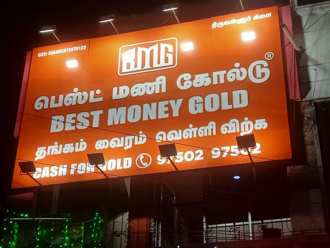
Colour is usually the first design decision, but it should never be based only on personal taste. A bakery, jewellery showroom, hospital, hotel, school, cafe and electronics shop need different emotional tones. But all of them need contrast. Low-contrast colours make a sign look premium on a laptop screen and invisible on a busy road.

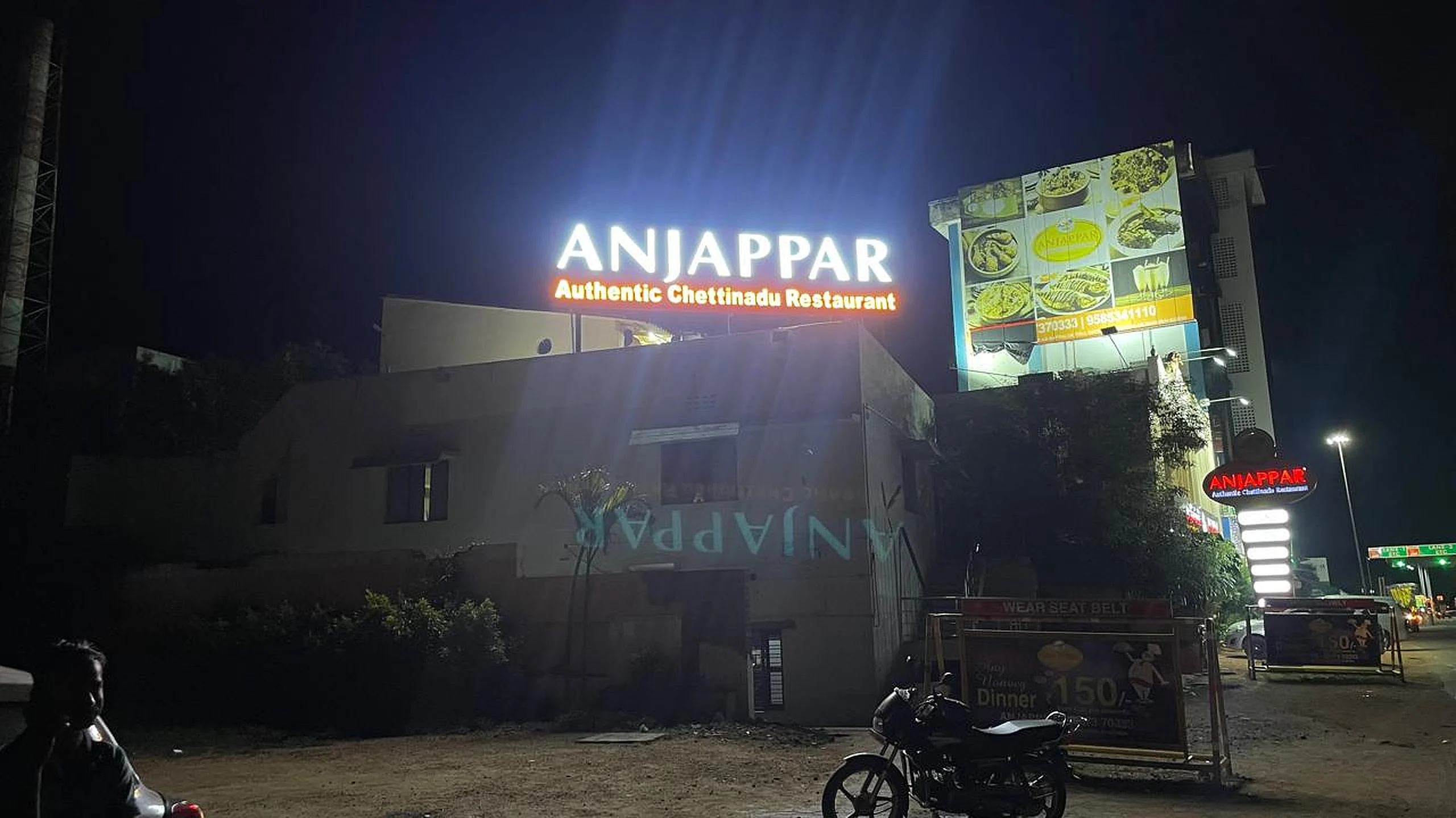
For safety and colour reference, the Bureau of Indian Standards and IS 9457 safety colours and safety signs are useful background sources. They show that colour has meaning, not only beauty. In brand signage, red can create urgency, gold can create premium value, blue can feel corporate, green can feel healthcare or organic, and black can create luxury when paired with bright lettering.

Colour rules that work

  • Use one main brand colour, one contrast colour and one neutral background.
  • Avoid red text on black, gold text on white, and grey on blue for small lettering.
  • Use bright-gold, white or warm white letters on dark premium panels.
  • Use black, charcoal or deep blue text on light ACP/acrylic backgrounds.
  • Keep service text simpler than brand-name text.
Common colour combinations for shop sign boards
Colour CombinationBest ForVisibility Note
White letters on black / charcoalPremium showrooms, salons, boutiques, hotelsStrong contrast, works well with LED backlighting
Yellow or gold accents on dark panelsJewellery, luxury retail, corporate officesUse gold as accent, not small body text on pale backgrounds
Red and whiteRestaurants, clinics, emergency visibility, food brandsPowerful but should be balanced to avoid glare
Blue and whiteHospitals, education, finance, technology businessesProfessional and readable when contrast is strong

Need colour combinations for your logo and frontage?

Ask for Colour Advice
FONTS

Font Selection: The Difference Between Stylish and Readable

Fonts are where many sign boards fail. A beautiful script font may look emotional in a wedding invitation but unreadable on a 20-foot storefront. The main business name must have enough stroke thickness, spacing and letter height. Secondary text can be smaller, but it should never compete with the brand name.

Use bold main lettering

Choose a bold, clean font for the business name. 3D stainless steel, titanium gold, acrylic and LED channel letters need enough stroke thickness to hold structure, wiring and illumination.

Avoid too many fonts

Two fonts are enough for most boards: one for the brand and one for supporting information. Three or more fonts make even an expensive sign look like a low-cost banner.

Respect local language

For Tamil, Hindi, Malayalam, Telugu, Kannada or bilingual boards, make sure the regional text is not treated as an afterthought. It needs correct spacing, stroke thickness and hierarchy.

A practical sign should be designed like a public information system: quick to read, hard to misunderstand and easy to remember. That is why accessibility and typography references matter even when the final product is a physical LED sign.

Send your logo and we’ll check whether the font will work as signage.

Check My Logo
SIZE

Letter Size and Viewing Distance: Design for Real Roads

A sign board is not a visiting card. People see it from across the road, below the building, inside a moving vehicle or from a parking area. This is why a design that appears balanced on screen can fail after installation. The most important text must be large enough for the expected viewing distance.

Practical letter-size planning guide
Viewing SituationDesign PrioritySuggested Approach
Small shop in narrow streetFast pedestrian recognitionLarge brand name, simple icon, minimal service text
Showroom on main roadVehicle and parking visibilityWide LED or 3D letters, clear contrast, night test
Hospital / clinic frontageTrust and emergency clarityReadable medical category, calm colours, controlled brightness
Hotel / restaurant elevationEvening visibility and moodWarm LED, neon accent, entry-focused hierarchy
Mall or indoor storePremium finish and brand recallAcrylic edge signs, 3D letters, clean backlit logo

Weather also affects size decisions. In coastal, dusty or high-rainfall locations, the sign may need stronger contrast and better lighting. The India Meteorological Department is a useful public reference for understanding regional weather patterns, while official electrical and waterproofing decisions should be handled by a signage team.

Unsure what size will work for your road width?

Plan My Sign Size
LAYOUT

Layout Hierarchy: What Should People Read First?

Every sign board has a reading order. If the phone number is larger than the brand name, the sign feels noisy. If the logo is huge but the business category is unreadable, customers may remember the colour but not the service. The right hierarchy usually follows this order: brand name, business category, trust cue, contact or direction.

For design quality, BRS SIIGNS recommends a simple viewing test: reduce the design to a small thumbnail and ask whether the brand name is still clear. Then view it from a distance on a phone. If the design fails these tests, it will likely fail after installation.

Hierarchy checklist

  • Brand name is the largest element.
  • Business category is clear but secondary.
  • Logo has breathing space around it.
  • Text is not placed too close to edges.
  • Phone number is optional, not dominant.
  • Icons support the message but do not replace words.

Municipal and safety rules also matter when a board faces a public road. Rules differ by location, but government references such as Tamil Nadu hoarding rules show why advertising structures must avoid traffic confusion, unsafe placement and visual disturbance. For any city, always check local permissions before installing large outdoor boards.

Want a clean layout instead of a crowded board?

Send My Draft
LIGHTING & MATERIALS

Match the Design to the Right Sign Board Material

Design and material cannot be separated. Thin fonts are difficult in 3D metal letters. Large glowing backgrounds need correct LED spacing. Acrylic needs careful cleaning and edge planning. ACP panels need correct sheet quality and mounting. A good design becomes successful only when the manufacturing method supports it.

For electrical safety and energy thinking, refer to the Central Electricity Authority, CEA safety regulations 2023 and Bureau of Energy Efficiency. For outdoor durability, IEC IP ratings are useful for understanding water and dust resistance language. End-of-life electronics should also be handled responsibly using references such as CPCB e-waste rules and the PIB e-waste update.

Design choice by material type
Material / TypeBest Design UseBRS Price Reference
LED sign boardNight visibility, restaurants, retail, hospitals, main roads₹850–₹3,500 per sq.ft
3D SS lettersPremium shopfronts, offices, showrooms, hotels₹450–₹3,500 per letter up to 1 ft
Acrylic edge signModern logos, reception walls, boutiques, clinics10-year acrylic warranty reference
ACP base panelLarge clean background for LED or 3D letters₹220–₹450 per sq.ft for 3mm Eurobond ACP
Vinyl / UV flexPromotions, budget frontage, temporary campaigns2-year flex/vinyl warranty reference

Need help choosing between LED, acrylic, ACP and 3D letters?

Compare Materials
BUSINESS MATRIX

Best Sign Board Design Tips by Business Type

Quick design matrix for Indian businesses
Business TypeBest Visual StyleDesign Tip
Jewellery showroom3D titanium gold letters + dark ACPUse fewer words, premium spacing and controlled warm lighting.
Restaurant / cafeLED neon, channel letters, food-friendly coloursMake the name readable at night and keep food photos secondary.
Hospital / clinicClean LED letters, blue/white/red accentsPrioritise department clarity, emergency visibility and calm trust.
Corporate office3D SS letters or acrylic reception brandingUse understated colours, clean logo spacing and premium finish.
Textile / retail showroomLarge LED sign, modular facade, brand coloursUse a wide sign with a bold brand name and clear category.

Business compliance and procurement also matter for larger orders. When companies need documentation, GST and vendor details, public references like the GST Portal, Ministry of Corporate Affairs, Udyam Registration, Quality Council of India, ISO, Make in India and Invest India can support supplier evaluation and business planning.

Tell us your business type and frontage size.

Get Design Suggestion
MISTAKES

7 Sign Board Design Mistakes That Reduce Visibility

1. Choosing colours without contrast

A brand colour may be meaningful, but if it cannot be read from the road, it should not be used for small text. Contrast should be checked before manufacturing.

2. Making every line important

When every word is large, nothing is important. Give the brand name visual priority and let supporting text stay secondary.

3. Using thin fonts for 3D letters

Thin strokes can break, bend, glow unevenly or become difficult to fabricate. 3D letters need sign-friendly thickness.

4. Ignoring night appearance

A daylight mockup is not enough for LED and neon signs. Always check night glow, glare, shadow and colour balance.

5. Filling the board with contact details

A sign board is mainly for recognition. Phone numbers, offers, directions and QR codes should not overpower the name.

6. Choosing cheap LEDs and weak SMPS

Poor lighting makes even a good design look patchy. BRS SIIGNS uses quality LED and SMPS planning with warranty-backed work.

7. Forgetting weather and maintenance

Outdoor signs need waterproofing, safe wiring, access for service and materials that can handle sun, dust and rain.

Avoid these mistakes before production starts.

Review My Design
BRS SUPPORT

Design, Manufacturing, Warranty and Installation Support

BRS SIIGNS was founded in 1989 by Mr. Benjamin and is currently led by Mr. Bennir Raja, B.E. (EEE), with Mr. Bensily Raja as Chief Visionary Officer. The company has 35+ years of experience, 12,000+ installations, 16,000+ projects, 25,000+ happy customers and a 30+ member installation crew.

All seven core services are manufactured in-house: LED / neon sign boards, LED running displays, 3D SS / titanium / copper letters, acrylic edge signs, modular signage systems, vinyl / UV flex signage and custom mementos.

Warranty reference

  • 2 years warranty on flex printing and vinyl.
  • 2 years warranty on power supply / SMPS.
  • 5–7 years warranty on LEDs, depending on LED type.
  • 10 years warranty on acrylic.
  • 12 years warranty on ACP and stainless steel.

Read the full BRS SIIGNS warranty policy.

Need a sign design that looks good and reads clearly?

WhatsApp for Design Quote
FAQ

Sign Board Design Tips Questions

Keep the brand name large, use high contrast colours, limit the message to one clear promise, avoid thin fonts, include only essential contact details and choose lighting that matches the street environment. A shop sign should be readable before it becomes decorative.

The best colour combination depends on the brand and background, but high contrast usually works better than low contrast. White on dark, yellow on black, black on light colours and bright letters on muted panels are common choices. Avoid similar-value colours such as red on black or grey on blue for small text.

Bold sans-serif fonts, clean serif fonts with thick strokes and simple custom letterforms work best for distance reading. Avoid very thin script fonts, compressed fonts and decorative fonts for the main brand name unless the sign is very large and supported by lighting.

Letter size depends on viewing distance, road speed, mounting height and lighting. A tiny sign may look neat in design software but fail on a real street. As a simple rule, make the business name the largest element and test readability from the opposite side of the road before final approval.

Use LED or LED neon when night visibility matters, acrylic edge signs for premium indoor and front-lit effects, 3D stainless steel or titanium letters for luxury branding, and ACP/flex panels when you need large coverage at a practical budget.

Use as few words as possible. Brand name, category, one trust phrase and one contact method are enough for most shopfronts. Too much text reduces readability, especially on busy roads where people only glance for one or two seconds.

Yes. BRS SIIGNS can help with sign concept, material selection, colour choice, font readability, 3D mockups and manufacturing planning before production. Share your logo, shop photo, frontage size and preferred style on WhatsApp.

Common mistakes include low-contrast colours, too many fonts, overfilled text, poor logo spacing, wrong letter size, cheap LEDs, weak ACP paneling, no waterproofing plan and no viewing-distance test before manufacturing.

No. Local weather, street lighting, municipal rules, road width and shopfront surroundings vary. A beachside board, high-street retail sign, hospital sign and mall kiosk sign need different colour, brightness and mounting decisions.

Send your logo file, shopfront photo, approximate sign size, city, business type, preferred material, night visibility need, budget range and any municipal restrictions. This helps BRS SIIGNS suggest the right design and cost range.

GET A DESIGN QUOTE

Plan a Clear, Premium Sign Board with BRS SIIGNS

Send your logo, shopfront photo, sign size, business type, city and preferred material. BRS SIIGNS can suggest colours, size, font, material, lighting and approximate price range before manufacturing.

Get Free Quote