VisibilityDesign and night visibility checklist
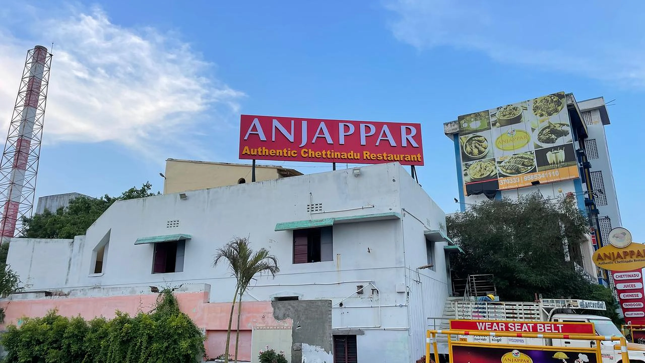
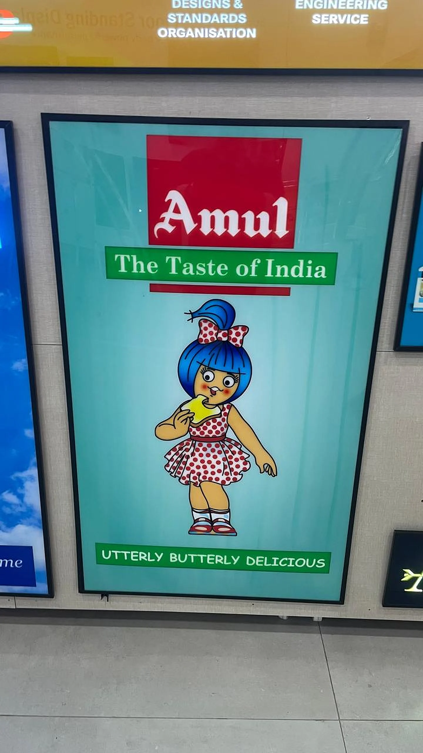
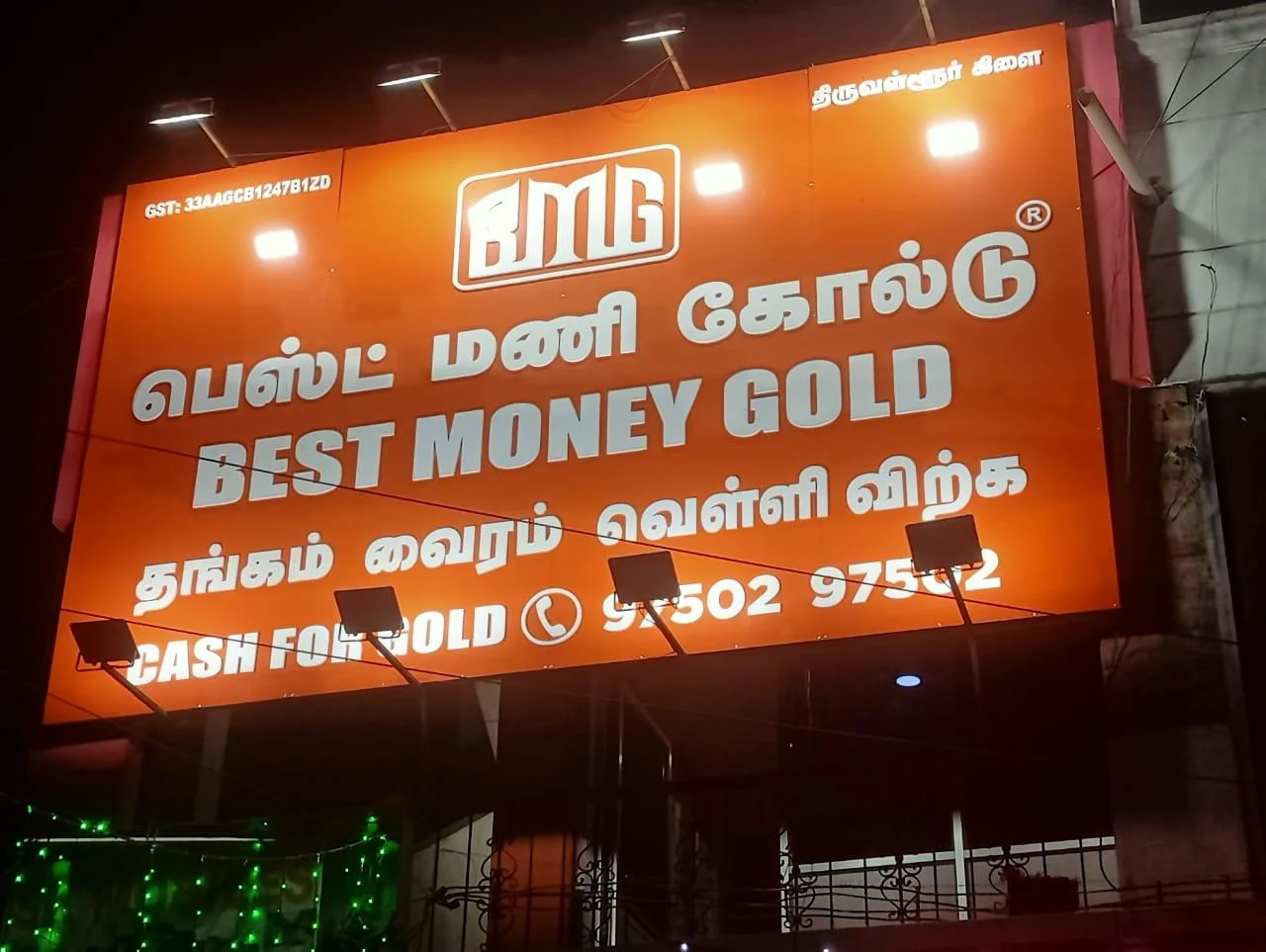
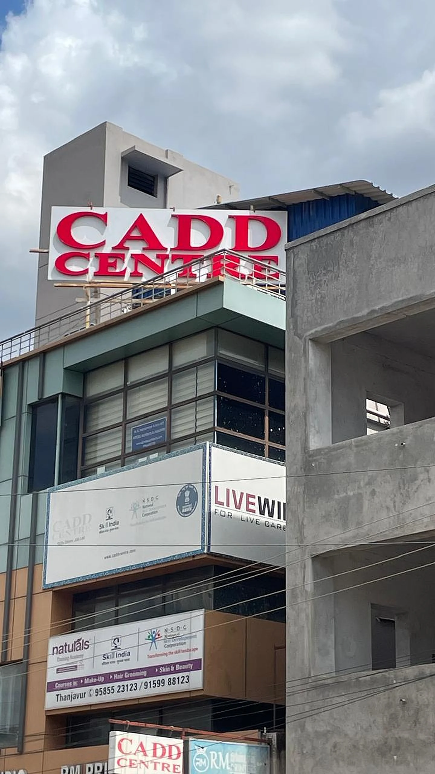
A good sign board is not just a rectangle with a logo. Before production, BRS SIIGNS checks viewing distance, road direction, day/night contrast, Tamil and English text balance, letter thickness, mounting height and local light pollution. For Peravurani, this matters because many buyers depend on repeat recognition from roads leading towards Pattukkottai, Aranthangi, Sethubavachatram and surrounding villages.
Use large text for the business name, medium text for service, and minimum text for phone numbers. Keep material colours closer to the brand, but never sacrifice readability. When digital display or LED control systems are used, follow practical cyber and electronics awareness from MeitY and choose safe power routing.
Day check
Stand across the road and read the board in sunlight. If the logo is visible but the business type is not readable, increase spacing or contrast.
Night check
Test brightness after sunset. Over-bright boards can reduce readability and disturb nearby shops; balanced glow is better.
Local language
Add Tamil where useful for local recall, especially for pharmacies, service centres, provision stores and food outlets.
Future updates
For seasonal offers, keep a removable flex or small running display instead of crowding the main board.