3D Metal Letters • Brand Identity • Font Guide 2026
How to Choose the Right Font for Your 3D Metal Letter Sign — Complete Brand Identity Guide for Tamil Nadu & India
Let me ask you something directly: do you know that the font on your sign is making a brand statement to every single person who walks past — whether you planned it or not? After 35+ years crafting 3D metal letter signs for 25,000+ businesses across Tamil Nadu, I can tell you that font choice is the most underestimated branding decision most business owners make. This guide will change that.
Why Font Choice Matters →
☰ Table of Contents
- Why Font Choice Matters for 3D Metal Letter Signs
- Font Psychology — What Your Font Says About Your Brand
- Popular Font Categories for 3D Metal Signs in 2026
- How to Match Fonts to Your Industry in Tamil Nadu & India
- Tamil Nadu & India-Specific Font Considerations
- Technical Factors — Readability, Size & Depth
- Common Font Mistakes to Avoid
- Real Success Examples from Tamil Nadu Businesses
- Step-by-Step Guide to Choosing the Right Font
- Why Choose BRS SIIGNS for Expert Font Guidance
- Frequently Asked Questions
Brand First Impressions • The Signage Psychology Nobody Talks About
Why Font Choice Is the Most Underestimated Branding Decision You Will Make
First Impressions: Your Sign Speaks Before You Do
Here's something I want you to sit with: research from the brand management field shows that people form a first impression of a business within 7 seconds of encountering it. For a business with a physical shopfront, that first impression is almost always your sign. And within that sign, the font carries more psychological weight than the colour, the material, or even the size.
Think about the last time you walked past a 3D metal letter sign with a sophisticated serif font outside a jewellery showroom, versus a hand-painted board. Which one made you assume the jeweller inside would care about quality? Your customers make the same instant judgment about your business every single day — whether you've thought about your font or not.
The core truth after 35+ years: Your font is not decoration. It is a business communication tool that works 24 hours a day, 365 days a year, speaking your brand values to every potential customer who passes your premises — silently, powerfully, and permanently.
How Font Affects Customer Trust & Perceived Quality
In competitive markets like Chennai, Coimbatore, Trichy, and Bangalore, customers have more options than ever. When they're choosing between two similar businesses, they often make the decision before they've even asked a single question inside. A poorly chosen font — too playful for a clinic, too dated for a tech company, too thin to read from the road — can cost you customers you never even knew you were losing.
Conversely, the right font for your 3D metal letter sign creates an immediate alignment between what your business promises and what the customer expects to find inside. That alignment builds trust before a single word is exchanged.
Long-Term Investment: Your Font Will Last 10–15 Years
This is the practical reality most businesses miss: a quality 3D metal letter sign will remain in place for 10–15 years or more. The font you choose today will be speaking to customers in 2035 and 2040. Spend the time to get it right now. The cost of a poor choice is not just aesthetic — it's a decade of missed brand opportunities and potential customers turning away.
Font Psychology • What Every Business Owner Should Understand
Font Psychology — What Your Font is Telling Every Customer Who Sees Your Sign
Every font category triggers a predictable set of emotional and cognitive associations in the viewer. This is not opinion — it's well-documented in cognitive psychology research. Understanding this gives you a powerful branding advantage.
Sans-Serif Fonts — Modern, Clean & Approachable
Sans-serif fonts (no decorative strokes at letter ends) are the most popular choice for 3D metal letters in 2026. They communicate modernity, cleanliness, and forward-thinking confidence. Highly readable at distance, making them ideal for Tamil Nadu's busy main roads and commercial streets.
Popular examples: Montserrat, Futura, Helvetica Neue, Roboto, Inter, Gotham
Best for: Tech companies, startups, retail stores, modern corporate offices, co-working spaces
Serif Fonts — Traditional, Trustworthy & Premium
Serif fonts (with decorative strokes at letter ends) communicate tradition, trust, and premium quality. They have centuries of association with institutions of authority and refinement. In Tamil Nadu, they're especially powerful for businesses that want to project heritage and permanence.
Popular examples: Garamond, Playfair Display, Bodoni, Didot, Times New Roman
Best for: Law firms, jewellery showrooms, luxury hotels, financial institutions, educational institutions
Script & Handwritten Fonts — Elegant, Creative & Personal
Script fonts mimic handwriting or calligraphy. They convey elegance, creativity, and a personal human touch. Beautiful for indoor installations or businesses that want to feel warm and personal. Caution: complex scripts can reduce readability at distance — always test at viewing distance before finalising.
Popular examples: Great Vibes, Pacifico, Sacramento, Allura
Best for: Jewellery stores, wedding planners, beauty salons, premium restaurants, interior design studios
Bold & Geometric Fonts — Strong, Innovative & Technical
Bold fonts with strong geometric proportions communicate strength, precision, and innovation. They create maximum visual impact and are particularly effective on large outdoor facades and highway-facing installations where the sign must cut through visual noise from a significant distance.
Popular examples: Impact, Bebas Neue, Anton, Oswald, Industry
Best for: Automotive showrooms, engineering companies, manufacturing facilities, sports and fitness brands
2026 Font Category Guide • 3D Metal Letters India
Popular Font Categories for 3D Metal Signs in 2026 — With Real Brand Examples
Let me break down the major font categories with specific guidance for 3D metal letter fabrication. Not all fonts that look good on screen will look equally good in metal. Here's what I've learned from producing thousands of signs:
| Font Category | Visual Personality | 3D Metal Suitability | Ideal Industries | Cost Impact |
|---|---|---|---|---|
| Clean Sans-Serif | Modern, professional, approachable | ★★★★★ Excellent — wide strokes, easy to fabricate precisely | Tech, Retail, Corporate, Healthcare | Standard |
| Classic Serif | Premium, trustworthy, established | ★★★★☆ Very good — serifs add elegance but add fabrication detail | Jewellery, Law, Finance, Luxury | +10–20% |
| Bold Geometric | Strong, impactful, innovative | ★★★★★ Excellent — high visibility, clean cuts, strong shadow effect | Automotive, Industrial, Fitness, Construction | Standard |
| Elegant Script | Creative, refined, personal | ★★★☆☆ Moderate — thin strokes risk structural weakness in metal | Salons, Restaurants, Jewellery, Events | +25–45% |
| Slab Serif | Sturdy, dependable, heritage | ★★★★☆ Very good — bold, durable, excellent outdoor visibility | Industrial, Food, Heritage Brands | +10–15% |
| Custom / Modified | Unique, branded, distinctive | ★★★★☆ Excellent when well-designed — creates unmatched differentiation | Premium brands wanting unique identity | +30–50% |
The Material Factor: How SS, Titanium Gold & Copper React Differently to Fonts
Here's something specific to 3D metal letter manufacturing that most design guides don't cover: the finish material you choose significantly affects which fonts work best. Our SS (stainless steel) letters with a mirror or brushed finish create crisp, high-contrast edges that make clean sans-serif and bold fonts look especially powerful. Titanium gold finish adds warmth and luxury — it enhances serif and elegant script fonts beautifully. Copper finish creates an artisanal heritage feel that pairs exceptionally with slab-serif and custom vintage fonts.
Industry-Specific Font Guide • Tamil Nadu & India 2026
How to Match Your Font to Your Industry — A Business-by-Business Guide for Tamil Nadu
I've worked with businesses in virtually every sector across Tamil Nadu. Here's the industry-by-industry breakdown of what consistently works — and what repeatedly fails.
Retail & Fashion — Creative, Stylish, Distinctive
Tamil Nadu's retail sector, from Chennai's premium malls to Trichy's commercial streets, is intensely competitive. Retail brands need fonts that express personality while maintaining commercial clarity. For fashion brands targeting 18–35 year olds: contemporary geometric sans-serif with slight customisation. For ethnic wear and traditional retailers: serif or elegant script fonts that honour cultural heritage. The key principle: your font should make a potential customer's eyes stop — but then make the text easy to read.
Corporate & Professional Services — Clean, Professional, Authoritative
Law firms, financial institutions, insurance companies, and consulting firms in Tamil Nadu should choose clean, professional fonts that project reliability and seniority. We consistently recommend moderate-weight sans-serif fonts (Montserrat Medium, Proxima Nova, or similar) or classic serif fonts (Garamond, Baskerville) for corporate 3D metal letter installations. Avoid trendy or decorative fonts entirely — they age poorly and can undermine client confidence.
Hospitality & Healthcare — Warm, Welcoming, Trustworthy
Hospitals, clinics, hotels, and restaurants need fonts that create an immediate sense of welcome and safety. Slightly rounded sans-serif fonts (like Nunito or Poppins-style profiles) are excellent for healthcare. For restaurants and hotels, an elegant serif or refined script can elevate the perceived dining or accommodation experience — when combined with LED backlit or LED neon complementary signage, the effect is extraordinary.
Automotive & Industrial — Bold, Strong, Precise
Automotive showrooms along Avinashi Road in Coimbatore, Bangalore's industrial belt, and Chennai's automotive corridor benefit enormously from bold, geometric fonts that communicate engineering precision. Wide-set uppercase lettering with strong vertical strokes creates commanding presence on large facades and is readable from significant highway distances. This is one category where font weight should always be heavy rather than light or medium.
Education & Institutions — Established, Trustworthy, Aspirational
Educational institutions face a specific branding challenge: they need to appear established and credible (to parents and funders) while also feeling aspirational and forward-looking (to students). Classic serif fonts communicate heritage and academic rigour; pairing them with a clean modern sans-serif for supporting text creates a productive tension between tradition and progress. Many of our Trichy educational institution clients have found this combination especially effective.
Tamil Nadu & India Specific • Cultural + Climate + Bilingual
Tamil Nadu & India-Specific Font Considerations — What Generic Design Guides Miss
Cultural Sensitivity & Local Appeal in Tamil Nadu
Here's something almost no design guide addresses for Indian audiences: fonts carry cultural connotations that vary significantly by region. Fonts that feel contemporary and aspirational in Chennai or Coimbatore may feel cold or foreign in more traditional markets. BRS SIIGNS' 35+ years in Tamil Nadu has taught us to balance international design sensibility with local cultural resonance.
The most consistently successful approach for Tamil Nadu businesses is choosing fonts that feel globally competent but locally rooted — clean and professional enough to compete with international standards, but with warmth and weight that feels appropriate for Tamil Nadu's cultural context. Ultra-thin, ultra-minimal fonts that work beautifully in a Tokyo or Stockholm context can feel sparse and cold to Tamil Nadu audiences.
Bilingual Tamil + English 3D Metal Letters — A Specialist Capability
Many businesses in Tamil Nadu want 3D metal letter signs that display both Tamil and English. This is technically demanding and requires specific expertise in Tamil script fabrication. Tamil characters have complex curves, loops, and conjuncts that require careful stroke design to translate into metal without losing readability or elegance.
Our bilingual approach: We design Tamil and English elements as a unified visual system — matched visual weight, complementary proportions, and harmonious spacing — so neither language appears dominant or appears to be an afterthought. Our Trichy manufacturing facility is one of the few in South India with specialist capability for premium Tamil-script 3D metal letter production.
Visibility in Indian Lighting Conditions
Tamil Nadu's climate creates specific visibility challenges: intense direct sunlight during summer (42–45°C, high UV), rainy-season diffused light during the northeast monsoon, and the glare from wet road surfaces. Fonts that perform beautifully in European or North American outdoor conditions may become difficult to read in Tamil Nadu's lighting environment.
Key recommendations from our field experience:
- Avoid ultra-thin stroke fonts for outdoor installations — they lose legibility in glare
- Minimum recommended stroke width for SS 3D metal letters: 8–10mm for characters below 200mm height
- For south-facing signs exposed to peak afternoon sun: slightly heavier font weights than you think you need
- Test your chosen font in both bright sunlight and low evening light conditions in your 3D preview
- Brush finish on stainless steel letters reduces harsh glare compared to mirror finish — better readability in peak sunlight
Hindi, Tamil, and Regional Language Considerations
For businesses across India that need multilingual 3D metal letter signs — Hindi + English, Tamil + English, or all three — consistent visual weight and proportional sizing between scripts is the critical technical challenge. We recommend always designing the multilingual layout in your 3D preview before committing to fabrication, as different script systems have very different vertical proportions (ascenders, descenders, and character heights differ significantly between Latin, Devanagari, and Tamil scripts).
Technical Guide • Readability • Size • Depth • Viewing Distance
Technical Factors — Readability, Letter Size, Depth & Viewing Distance for 3D Metal Letters
This is where design meets engineering — and where 35 years of practical experience really matters. The technical decisions you make about size, depth, and stroke weight will determine whether your beautiful font choice actually works in the real world.
Optimal Letter Height for Different Viewing Distances
| Viewing Distance | Recommended Letter Height | Typical Location | Font Weight Advice |
|---|---|---|---|
| 5–10 metres | 75–150mm (3–6 inches) | Reception areas, shop interiors, walkways | Any weight — script works here |
| 10–30 metres | 300–450mm (12–18 inches) | Street-level shopfronts, commercial complex facades | Medium to bold weight recommended |
| 30–60 metres | 500–750mm (20–30 inches) | Large commercial buildings, petrol pumps, hospitals | Bold weight — avoid script |
| 60–100 metres | 750mm–1m (30–40 inches) | Highway-facing signs, large industrial facades | Extra bold / heavy weight only |
| 100m+ | 1m+ (40 inches+) | Highway billboards, tall building facades | Heavy weight geometric / block fonts only |
Font Weight & Stroke Thickness for Optimal 3D Effect
The 3D effect in metal letters comes from the depth of the letter body (the side face) and how it catches and casts light. A font with too-thin strokes (hairline weights) cannot accommodate meaningful depth without becoming structurally fragile — letters under 3–4mm stroke width in metal are prone to bending, and shadows become invisible at any real viewing distance.
Our practical minimum stroke width recommendations for outdoor 3D metal letter signs:
- Stainless steel (SS) letters: Minimum 8mm stroke width for letters under 200mm height; 12mm minimum for 200–500mm
- Titanium gold / copper letters: Same minimums — the finish process requires sufficient metal substrate
- Script fonts: We often structurally reinforce thin stroke areas internally — this is included in our fabrication process at BRS SIIGNS
Depth Selection Based on Font Style
Depth (the thickness of the 3D letter body) is where many businesses leave visual impact on the table. The standard rule: delicate fonts (scripts, light serifs) → 25–50mm depth. Bold and geometric fonts can handle 75–150mm depth for dramatic shadow effects. At BRS SIIGNS, we provide depth recommendations as part of every free consultation — the right depth for your specific font, size, and lighting environment is not guesswork, it's a calculation based on decades of production experience.
Backlit vs Non-Backlit: How It Changes Font Requirements
If you're planning to pair your 3D metal letters with LED backlighting or LED neon, font requirements shift significantly. Backlit letters need sufficient internal volume to distribute light evenly — this means minimum stroke widths increase by approximately 20%, and very thin decorative elements should be avoided. The benefit of backlighting is extraordinary: your sign works 24 hours a day with consistent impact, making the additional font engineering absolutely worthwhile.
Avoid These Costly Errors • Learned from 35+ Years & 16,000+ Projects
7 Common Font Mistakes Tamil Nadu Businesses Make — And How to Avoid Every One
I've seen these mistakes hundreds of times across Tamil Nadu. Each one is avoidable with the right guidance upfront. Learn from 35 years of client outcomes so you don't repeat them.
Mistake 1: Choosing a Font You Like Personally Rather Than One That Serves Your Brand
This is the most common and most costly mistake. The font on your 3D metal letter sign is not personal expression — it's a business communication tool. A restaurant owner who loves vintage handwriting may choose a decorative script that beautifully expresses their personal taste but undermines the professional credibility their kitchen team has worked hard to build. Always ask: "Does this font communicate what my customers need to believe about my business?" — not "Do I love how this looks?"
Mistake 2: Ignoring Distance and Viewing Conditions
Choosing a font by looking at it on a computer screen at 100% zoom is meaningless. Your sign will be viewed from 10 to 100 metres, in Tamil Nadu's intense sunlight, at night, from moving vehicles, and in heavy monsoon rain. A font that's beautiful on a MacBook becomes an illegible blur from 30 metres in a Trichy afternoon. Always demand a scaled 3D visualization at the actual installation size and viewing distance — BRS SIIGNS provides this free.
Mistake 3: Using Overly Decorative Fonts That Sacrifice Readability
Elaborate ornamental fonts that look stunning on a wedding invitation become almost unreadable on a 3D metal sign at street level. Your first signage objective is always to be read. Decoration is a secondary goal. If a potential customer has to slow down or stop to figure out what your sign says, you've already lost the impression you wanted to make.
Mistake 4: Choosing Ultra-Thin or Light Font Weights for Outdoor Metal Letters
Ultra-thin, "hairline" fonts are a current design trend that works beautifully on digital interfaces and print. In 3D metal letters for outdoor use in Tamil Nadu, they're a structural and visibility disaster. Metal at 2–3mm stroke widths is fragile, prone to bending in transit or high winds, and casts almost no shadow — eliminating the dimensional effect entirely. Always choose medium weight (400–600) minimum for outdoor metal signs.
Mistake 5: Mismatching Font Personality with Brand Values
A playful, bouncy font outside a fertility clinic. A harsh, industrial block font outside a children's school. A cold, minimal tech font outside a traditional Chettinad restaurant. These misalignments happen more often than you'd expect — and they silently repel the exact customers the business wants to attract. Take the time to articulate your brand values in writing before you evaluate a single font option.
Mistake 6: Not Testing Bilingual Harmony
For Tamil Nadu businesses using Tamil + English, choosing two fonts that look acceptable individually but clash visually when combined is a very common error. The visual weight, proportions, and style of your Tamil and English text must be harmonised in the final layout — what works on two separate signs may look jarring as a single bilingual installation.
Mistake 7: Not Getting Professional 3D Visualisation Before Approving
Approving a font based on a flat 2D mockup — or worse, just a font name — is a significant risk. 3D metal letters interact with light, shadow, and environment in ways that are impossible to fully evaluate in 2D. BRS SIIGNS provides full 3D visualisations at actual scale as standard practice. Never approve a 3D metal letter sign without seeing it rendered accurately in 3D first.
Our guarantee: Every BRS SIIGNS client receives a detailed 3D visualisation at actual installation size before a single rupee changes hands. We will not proceed to fabrication until you are fully satisfied with the font, size, depth, and finish in the rendered preview. This is non-negotiable — it's how we maintain our 4.84★ Google rating across 340+ reviews.
Verified Client Case Studies • Tamil Nadu
Real Success Stories — Businesses in Tamil Nadu That Got Their Font Right
Case Study 1 — Luxury Jewellery Showroom, Chennai (2024)
A leading jewellery brand in Chennai came to us with an existing font from their print collateral — a decorative script that looked beautiful in gold foil on packaging but would have been structurally fragile and unreadable at street level in 3D metal. We proposed a refined, moderately weighted Didot-inspired serif with custom modifications to key letters — more structural than the original but retaining the premium, feminine elegance their brand required.
Outcome: The sign immediately drew customer attention and was featured in two local lifestyle publications within 3 months of installation. The jeweller reported that multiple customers specifically mentioned the sign's elegance as a reason they chose to enter. The titanium gold letter finish paired with the serif font created the premium signal the brand required.
Case Study 2 — Technology Company, Coimbatore (2023)
A software company in Coimbatore's tech corridor initially wanted their logo font (a very thin, modern sans-serif) reproduced in 3D metal letters for their new office reception. We advised that the stroke width was too thin for structural integrity and would lose the designed precision of the original at scale. We proposed a moderately heavier variant of the same geometric sans-serif family — retaining the modern, clean personality but with sufficient weight for metal production.
Outcome: The brushed stainless steel letters with the adapted font now anchor their reception area powerfully. Visitors consistently note the sign as a marker of the company's professional maturity. The modular signage system we installed alongside has since been extended to three additional office floors.
Case Study 3 — Premium Restaurant, Trichy (2025)
A fine-dining restaurant in Trichy wanted a 3D metal letter sign for their facade that would communicate premium positioning while maintaining warmth and approachability. After reviewing their interior design language and target demographic (working professionals, 30–50), we recommended a refined serif font — specifically designed to balance elegance with legibility at a 20-metre street viewing distance.
Outcome: The copper-finish 3D letters paired with the serif font created a heritage-meets-contemporary aesthetic that precisely matched their brand vision. Within two months of installation, they saw a measurable increase in first-time visitors — tracking from Google Maps reviews that specifically mentioned the "beautiful exterior" as a reason for visiting.
What Our Clients Say About Font Guidance
"The font guidance from BRS SIIGNS was exceptional. They helped us choose the perfect serif font for our 3D gold letters — elegant, premium, and exactly aligned with our brand. Customers constantly compliment the signage."
Chennai, Tamil Nadu
"The 3D metal letter sign with a clean sans-serif font transformed our reception. Visitors immediately sense we are a professional, forward-thinking company. The quality is outstanding."
Coimbatore, Tamil Nadu
"BRS SIIGNS understood our brand and recommended a refined font that balances elegance with readability. Our facade sign is now a recognizable landmark. World-class craftsmanship."
Trichy, Tamil Nadu
5-Step Process • Start to Approved Design
Step-by-Step Guide to Choosing the Right Font for Your 3D Metal Letter Sign
Follow these five steps in order. They represent the same process our in-house design team uses with every client consultation — now available to you as a self-guided framework.
Define Your Brand Personality in Writing
Before opening a single font website, write down 5 words that describe your brand essence. Examples: "modern, trustworthy, Tamil-rooted, premium, accessible" or "bold, innovative, precision-focused, international, clean." This written foundation must be your filter for every font decision. Any font that doesn't reflect at least 3 of your 5 words is eliminated immediately — regardless of how attractive it looks.
Research Your Competitors' Signage
Walk your local commercial area (or research your direct competitors online) and observe the fonts they've used for their 3D metal or LED signs. Identify: which fonts create the strongest impression? Which look dated or inappropriate? Where is there an opportunity to differentiate? This competitive audit takes 30 minutes but provides invaluable positioning insight. BRS SIIGNS can assist with a competitive signage audit as part of our free consultation.
Apply the Technical Filter
Once you have 3–5 font candidates that align with your brand personality and differentiate from competitors, apply the technical filter: What is the minimum stroke width of each font at your required letter height? Will it maintain structural integrity in metal? Is it readable at your installation's maximum viewing distance? Does it have sufficient weight to create meaningful 3D shadow depth? Eliminate any candidates that fail these technical tests. Share your shortlist with BRS SIIGNS — we will evaluate fabrication feasibility for free.
Request Full 3D Visualisation at Actual Scale
This is non-negotiable. Request a 3D rendering of your top 2–3 font candidates at the actual installation size, in your chosen material (SS / titanium gold / copper), and in the lighting conditions typical of your location. BRS SIIGNS provides this fully at no cost and no obligation. Evaluate each option as if you're standing at the actual viewing distance — not looking at a small thumbnail on a screen. Review in daylight AND simulated evening light if your installation will be seen at night.
Test, Validate & Finalise
Share your 3D visualisations with 3–5 trusted people who represent your target customer (not just colleagues or family). Ask them one simple question: "What does this sign tell you about the business inside?" Their answers should align with your brand personality words from Step 1. If they do — you've found your font. If there's misalignment, revisit your shortlist with the feedback in hand. BRS SIIGNS will iterate on the design at no additional cost until you're fully satisfied.
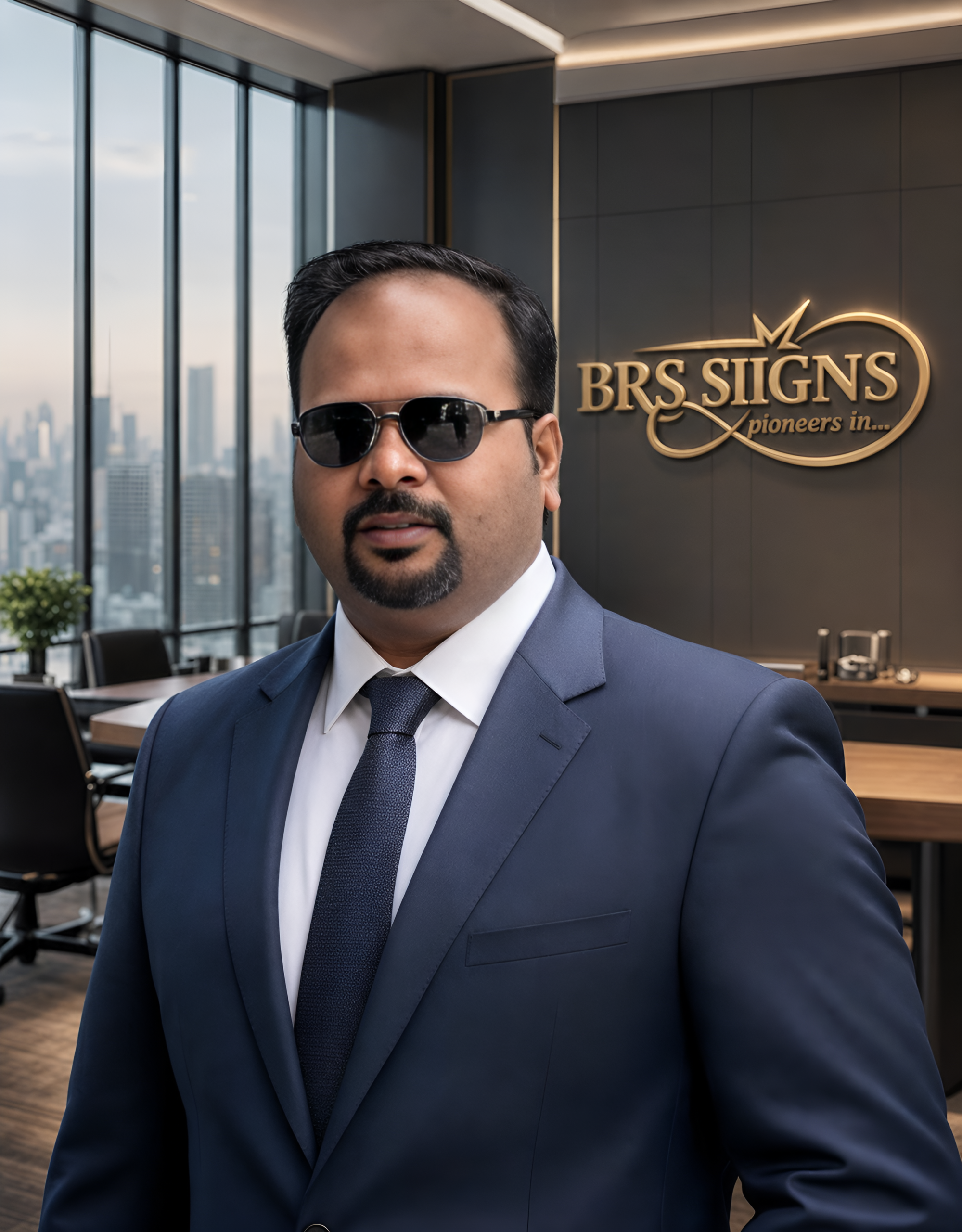
About BRS SIIGNS Trichy • Established 1989
Why Choose BRS SIIGNS Trichy for Expert 3D Metal Letter Font Guidance
I started BRS SIIGNS in 1989 with one commitment: to produce 3D metal letter signs that genuinely serve the businesses who invest in them — not just signs that look good in a showroom. 35+ years later, that commitment is reflected in every consultation, every 3D preview, and every installation we complete.
100% In-House Manufacturing — Zero Outsourcing
Every 3D metal letter we produce — SS, titanium gold, and copper — is designed, fabricated, quality-tested, and installed by our own team from our Trichy manufacturing facility. No outsourcing, no middlemen, no quality variability. This is rare in Tamil Nadu's signage market — and it's the foundation of our consistent quality and 4.84★ Google rating.
In-house manufacturing also means we can iterate on font designs, stroke widths, and depth specifications quickly during the consultation phase — without sending files to external fabricators and waiting. Your 3D metal letter sign gets from approved design to installation faster, with full quality control at every step.
In-House Design Expertise with Deep Tamil Nadu Market Knowledge
Our design team has worked with businesses in virtually every industry across Tamil Nadu — from petrol pumps in rural districts to luxury showrooms on Chennai's high streets. We understand the specific visual language that resonates with Tamil Nadu audiences, the cultural nuances that affect font perception, and the practical performance requirements of Tamil Nadu's outdoor environment. This is knowledge that cannot be replicated by a design agency without signage fabrication experience, or a fabricator without deep design expertise.
Free Consultation, Free 3D Preview, No Obligation
WhatsApp us at +91 94867 50872 with your business name, industry, and installation location. We'll send you preliminary font recommendations with rationale, and a 3D rendered preview within 24 hours. No cost, no commitment. If you're not fully satisfied with the result, we iterate until you are. This is our standard process — not an exception — for every client regardless of project size.
Explore our full range: 3D Metal Letters • LED Neon Signs • Acrylic Edge Signs • Modular Signage • Vinyl & UV Flex
Frequently Asked Questions • 3D Metal Letter Font Guide
Your Questions Answered — 3D Metal Letter Fonts for Tamil Nadu & India
Verified External Resources • Typography • Signage • India
Useful Resources for Businesses Researching 3D Metal Letter Fonts & Signage
We believe informed clients make better decisions. Here are authoritative resources we recommend for businesses researching signage, typography, and brand identity in India:
Free Font Consultation • 24-Hour 3D Preview • Tamil Nadu-Wide Service
Ready to Choose the Perfect Font for Your 3D Metal Letter Sign?
WhatsApp us with your business name and a photo of your installation location. We'll deliver tailored font recommendations and a free 3D visualisation within 24 hours — zero cost, zero obligation. Serving businesses across Trichy, Chennai, Coimbatore, Madurai, Salem, and all of Tamil Nadu and India.